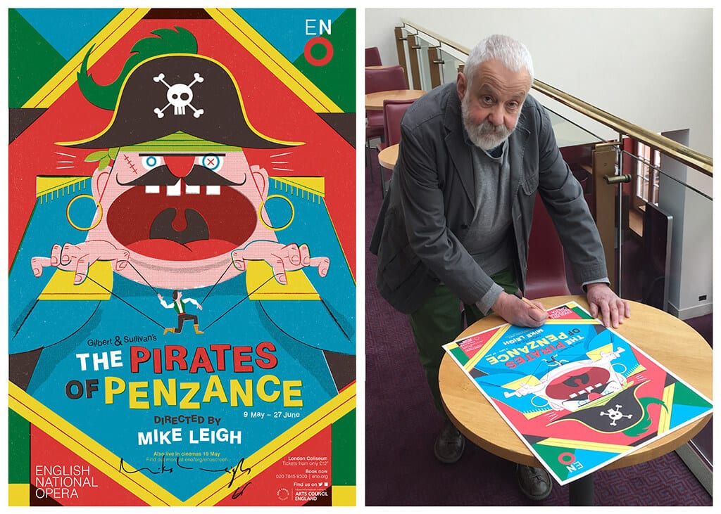
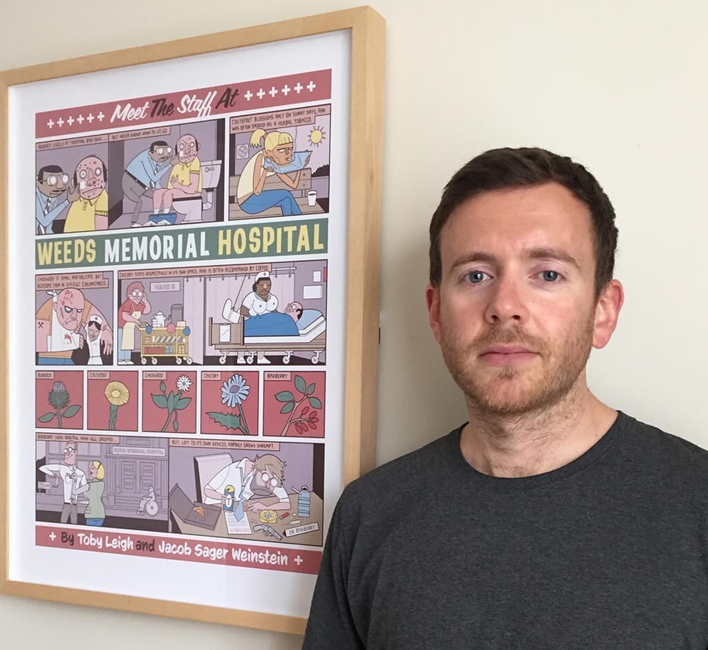
Toby Leigh, illustrator and artist, is the author of the colourful poster promoting the English National Opera’s new production of Gilbert and Sullivan 19th century opera The Pirates of Penzance.
RJ: How did you go about designing this poster? What were the specific ideas that influenced you?
TL: I looked at lots of images from the last 100 years related to the show- costume designs, posters etc. I wanted to convey the overbearing Pirate King and his controlling influence over Frederic.
RJ: The poster is busy and loud. Who is the targeted audience?
TL: The environment that posters live in are very busy and loud. If you walk down the platform of the Tube for example, it’s amazing how many posters get lost amongst the thousands of people, noise and other adverts. I wanted to create something that would slap you in the face. It was also important for it not to look like a typical ‘opera’ poster. The show itself is different because Mike Leigh is directing it, but the ENO also wanted to pull in a broader and younger demographic.
RJ: How much did your experiences of performances of The Pirates of Penzance influence the image you wanted to project in the poster?
TL: I’d never actually seen it live before, but watched a prety lame version on Youtube which didn’t really have too much influence.
RJ : Has the fact that your father , Mike Leigh, is the director of this production, has been help or a hindrance in designing the poster and why?
TL: It’s a great help working closely with someone who has a similar outlook and sense of humour. We’re into a lot of the same cartoonists and artists. We’ve also worked together on other posters.

RJ: How do you preserve your creativity within the parameters set by client’s guidelines?
TL: It can be a difficult battle at times. I’ve been working as a designer for over 15 years, so I’ve become more comfortable with putting my foot down when a client is being stupid. The trick is to keep trying out new things and experimenting with new approaches/ ideas, otherwise it can get very stale. I also do a lot of personal projects which keeps me sane.
RJ: What are the challenges facing a young designer of theatre posters today?
TL: Theatre posters in London are generally quite dull and old fashioned, and don’t take many risks. Which is why you have to hand it to the ENO for commissioning my poster. A lot of the big institutions have a in house design team who do tend to regurgitate the same things over and over again. The National Theatre do some good stuff nowadays.
RJ: Has digital software and expertise replaced much of the ‘old artistic skills?
TL: The computer is just another tool. A really f*cking good paintbrush if you like. Put it in the hand of a bad designer and you’ll get bad work. If Picasso had had Photoshop he’d still be regarded as the greatest.
RJ: What is your next big project?
TL: I’ve just done a poster for the Arizona Theatre Company in the US. I’m also working on various personal projects including making a book.
A limited edition of 100 prints of The Pirates of Penzance poster designed by Toby and signed by Mike Leigh are available to buy here.

